
Food: The Chromatic Shift: How Emotional Colour Cues Are Redefining Food & Beverage in 2026
- InsightTrendsWorld

- Nov 17, 2025
- 6 min read
What the Trend Is: Consumers Use Colour as a Shortcut to Emotion, Wellness and Novelty
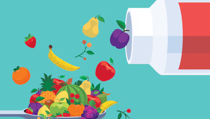
Shoppers gravitate toward food colours that evoke warmth, vitality, calm, or uniqueness, linking colour directly to how they want to feel.
Yellow and orange dominate as warmth-driven comfort cues: These tones signal energy, nourishment and optimism. They help products feel emotionally uplifting during periods of stress and uncertainty.
Deep purples and jewel tones attract with rich, unusual flair: These shades feel premium and adventurous. They help brands stand out without relying on synthetic neon aesthetics.
Earthy blues and greens signal naturalness and curiosity: These hues invite exploration because they’re still rare in food. They also carry associations with sustainability and plant-forward eating.
Turquoise rises as a calming, balanced colour choice: Its association with mental clarity and emotional reset resonates with anxious consumers. It blends novelty with a soft, soothing presence.
Burgundy signals vitality and strength: Consumers link it to protein, longevity and active lifestyles. It also carries a sense of richness that enhances perceived premium value.
Insight: Colour is becoming an emotional interface for food, shaping expectations even before taste or nutrition enters the equation.
Why It’s Trending: Wellness Culture and Mood-Driven Eating Are Reshaping Colour Expectations
Consumers increasingly choose foods that make them feel balanced, energized or soothed.
Warm colours meet rising demand for emotional comfort: People seek foods that feel cozy and stable during uncertain times. These tones reinforce a narrative of nourishment and wellness.
Rich, deep hues tap into premiumization: Jewel tones feel sophisticated and modern. They allow brands to communicate indulgence without heavy formulation changes.
Calming colours address stress culture: Turquoise and soft blues connect to mental balance and restorative self-care. They signal that food can offer emotional decompression.
Earth-driven tones mirror clean-label priorities: Natural-looking blues and greens hint at botanical or functional benefits. They strengthen the perception of authenticity.
Insight: The colour palette of 2026 mirrors consumers’ emotional needs as much as their nutritional goals.
Overview: Colour as Emotional Design in Food & Beverage
Manufacturers increasingly use colour as a strategic tool to attract mood-focused consumers seeking reassurance, novelty or functional cues. Warm tones project comfort and wellness. Vivid jewel tones create visual intrigue. Blues, greens and turquoise offer calm or natural authenticity. Burgundy aligns strongly with strength, performance and longevity.
Insight: Colour is now a primary driver of product desirability and functional perception.
Detailed Findings: How Colour Drives Product Appeal in 2026
Warm tones align with wellness positioning: Orange and yellow signal immune support, digestion benefits and energy. They are visually linked to positive, uplifting emotions.
Purples cue functionality and sophistication: Consumers associate them with antioxidants, premium fruit, and modern aesthetics. They help products feel elevated without added complexity.
Earthy greens/ blues tap into natural exploration: These rare colours imply nature-derived formulations. They also make everyday products feel more experimental.
Turquoise strengthens emotional safety cues: It carries strong associations with clarity, rest and authenticity. Its novelty helps products stand out at shelf while remaining gentle.
Burgundy communicates strength and vitality: Consumers read it as a marker of protein, collagen or performance benefits. Its boldness creates strong shelf presence in wellness categories.
Insight: Each colour has become a functional storytelling tool in itself.
Key Success Factors of Colour-Led Product Strategy
Emotional alignment: Colours must match the intended consumer mood or functional promise. This alignment increases product trust and intuitiveness.
Natural origin signals: Colours that appear naturally sourced build credibility. They also reduce consumer skepticism toward additives.
Shelf differentiation: Unique tones like jewel purples or turquoise outperform in crowded categories. These colours trigger curiosity and trial.
Cross-category flexibility: Burgundy and warm palettes work across beverages, dairy, confections and functional foods. Versatile colours scale more easily.
Insight: Winning colour strategy blends emotion, naturalness and visibility without overwhelming consumers.
Key Takeaway: Colour Has Become a Wellness and Experience Shortcut
Consumers rely on colour to make rapid decisions around perceived benefits, emotional fit and product quality.
Warm wellness colours convert quickly: They feel comforting and familiar, reducing hesitation at shelf.
Deep hues elevate everyday products: Jewel tones help affordable items feel premium.
Calming colours fill the mental-health need state: Turquoise particularly resonates with stressed, overstimulated consumers.
Performance colours boost functional credibility: Burgundy cues strength, vitality and healthy aging.
Insight: Colour now acts as a fast, intuitive signal for emotional and functional value.
Core Consumer Trend: Mood-Driven Eating
Consumers are increasingly choosing foods that help regulate stress, energy, or emotional balance. They turn to warm colours for comfort, deep hues for novelty, and calming tones for mental reset.
Insight: Food colour is becoming a form of emotional self-management.
Description of the Trend: Colour as a Wellness Shortcut
Warm tones reduce perceived stress: They feel optimistic and nourishing, strengthening emotional connection to food.
Rich purples enhance perceived nutrients: Consumers link them to antioxidants and fruit superfoods.
Calming blues soften sensory intensity: They make products feel gentle and soothing.
Burgundy cues strength visually: Its depth suggests functional potency and active-lifestyle fuel.
Insight: Consumers read colour as a signal of how the food will make them feel.
Key Characteristics of the Trend
Emotion-first selection: People choose colours that reflect desired moods. This creates stronger product attachment.
Naturalness expectations: Consumers seek colours that feel nature-derived rather than artificial.
Premiumization via depth: Jewel tones and burgundy unlock elevated positioning.
Wellness-coded clarity: Colours map clearly to benefit territories like immunity, calm, energy or vitality.
Insight: Colour clarity reduces decision fatigue and enhances product confidence.
Market & Cultural Signals Supporting the Trend
Rising stress culture increases demand for soothing tones: Shades like turquoise gain traction.
Functional foods dominate growth categories: Colour becomes a fast cue for benefit territories.
Reduced trust in additives increases demand for natural hues: Consumers scrutinize artificial colours more closely.
Social media amplifies visual trends: Colour-led aesthetics spread quickly through food creators and brand marketing.
Insight: Visual culture accelerates colour adoption faster than traditional product cycles.
What Is Consumer Motivation: Emotional Alignment in Food Choices
Desire for balance: Calming colours satisfy mental wellness needs.
Craving novelty: Rich, unusual tones make products feel exciting.
Association with health: Burgundy and yellow tones cue vitality.
Visual reassurance: Natural-looking colours build trust and ingredient confidence.
Insight: Colour is a small detail with outsized influence on consumer decision making.
Consumer Description: The Mood-Driven Food Explorer
Emotionally tuned: Uses food to manage energy and emotional states.
Visually oriented: Responds strongly to shelf aesthetics and colour cues.
Wellness-focused: Looks for products that signal health benefits.
Curious but cautious: Tries new colours when they feel natural and intentional.
Insight: This consumer relies on visual signals to simplify choices and shape expectations.
Areas of Innovation Implied by the Trend
Natural-source blues and greens: Innovation needed for stable, plant-based pigments.
Mood-specific colour design: Products aligned to calm, energy or focus.
Hybrid warmth-colour palettes: Combining yellow/orange with functional hues.
Burgundy-led performance categories: Expanding beyond beverages into snacks and meals.
Insight: Colour innovation will increasingly overlap with functional-food innovation.
Summary of Trends: Colour as a Wellness Language
Warm colours dominate for emotional comfort: They remain staples of wellness-positioned products.
Jewel tones create modern premium cues: They upgrade everyday formats.
Calming tones reflect mental-health priorities: Turquoise becomes the emblem shade of 2026.
Burgundy leads functional vitality signals: It reinforces strength and longevity.
Natural sourcing is non-negotiable: Colour credibility is tied to ingredient trust.
Cross-Trend Table: Core Frames Behind the 2026 Colour Shift
Trend Name | Category | Description | Insight |
Warm Wellness Palette | Core Consumer Trend | Consumers seek warm colours that evoke comfort and nourishment. | Warmth acts as emotional reassurance. |
Jewel-Tone Premium Shift | Core Social Trend | Deep purples and rich tones reflect desire for elevated, modern aesthetics. | Premium depth drives visual appeal. |
Calm-Tone Colour Therapy | Core Industry Trend | Turquoise and soft blues signal clarity and balance. | Calming colours address mental-wellness needs. |
Burgundy Vitality Signal | Core Strategy | Bold burgundy reinforces performance, strength and active living. | Burgundy strengthens functional storytelling. |
Natural Colour Integrity | Core Consumer Motivation | Consumers want colours that appear natural and trustworthy. | Authenticity fuels long-term loyalty. |
Main Trend: Food Colour as a Wellness and Mood-Shaping Tool
Colour has evolved from decoration to emotional design, shaping how consumers interpret health, flavour and experience.
Trend Implications for Brands & Consumers
Colour must align with emotional need states, functional benefits and natural-leaning expectations.
Insight: Brands that design colour with emotional precision gain faster adoption and deeper consumer trust.
Final Thought: The 2026 Colour Landscape Is Warm, Deep and Emotionally Intelligent
As consumers face stress, sensory overload and wellness fatigue, food colour becomes a stabilizing design language that offers comfort, vitality, novelty or calm.
Final Insight: The Future of Colour Is Emotional Precision
Colour will increasingly function as a strategic wellness signal—an unspoken promise about how the food will make the consumer feel.


Comments